Background
The dataset consists of year 2013 Big Mart sales data for 1559 products across 10 stores in different cities. The goal of this project is to predict the sales of each product at a particular outlet using Linear Regression.
Data Dictionary
- Item_Identifier: Unique product ID
- Item_Weight: Weight of product
- Item_Fat_Content: Whether the product is low fat or not
- Item_Visibility: The % of total display area of all products in a store allocated to the particular product
- Item_Type: The category to which the product belongs
- Item_MRP: Maximum Retail Price (list price) of the product
- Outlet_Identifier: Unique store ID
- Outlet_Establishment_Year: The year in which store was established
- Outlet_Size: The size of the store in terms of ground area covered
- Outlet_Location_Type: The type of city in which the store is located
- Outlet_Type: Whether the outlet is just a grocery store or some sort of supermarket
- Item_Outlet_Sales: Sales of the product in the particular store. This is our Target variable.
Loading Dataset
import pandas as pd
import numpy as np
import seaborn as sns
import matplotlib.pyplot as plt
from sklearn.impute import SimpleImputer
df_train = pd.read_csv('train_bigmartsales.csv')
df_test = pd.read_csv('test_bigmartsales.csv')
df_train.head()
Observation
- Looking at the dataset carefully, we noticed that Item types such as Dairy, Meat, Fruits and Vegetables etc. have an Item_Identifier starting with "FD", while the Drinks have an Item_Identifer starting with "DR" and household type have Item_Identifer starting with "NC"
# Combine training and test datasets so we don't need to repeat steps when testing our prediction model
df_train['source'] = 'train'
df_test['source'] = 'test'
df = pd.concat([df_train, df_test], ignore_index = True)
df_train.shape, df_test.shape, df.shape
# expecting 5681 missing values on variable Item_Outlet_Sales
# these missing values will be ignored since they are from test dataset
# and we are trying to predict these values
df.info()
Observations
- Categorical Variables:
- Item_Identifier
- Item_Fat_Content
- Item_Type
- Outlet_Identifier
- Outlet_Size
- Outlet_Location_Type
- Outlet_Type
- Continuous Variables:
- Item_Weight
- Item_Visibility
- Item_MRP
- Outlet_Establishment_Year
- Item_Outlet_Sales
- Variables with missing values:
- Item_Weight: missing 17.2% of data (2439)
- Outlet_Size: missing 28.3% of data (4016)
df.apply(lambda x: len(x.unique()))
Some Observations
- The above output shows there are 1559 unique products
- 5 unique types of Fat contents
- 16 unique Item types
- 10 unique outlets
Data Exploration and Data Cleaning
Univariate Analysis
Categorical Variables
Frequency table of Item_Type
df.Item_Type.value_counts()
fig, ax = plt.subplots(figsize = (7,5))
df['Item_Type'].value_counts().plot(ax = ax, kind = 'barh')
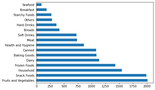
Observations
- Some categories have substantial counts while some don't
- Binning some categories together might be helpful
- we've identified the relationship between the Item_Identifer and Item_Type, we could use this to re-categorize the types
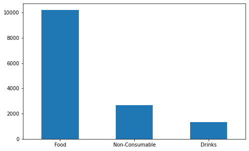
# Recategorizing Item_Types
df['Item_Type_cat'] = df['Item_Identifier'].apply(lambda x: x[0:2])
df['Item_Type_cat'] = df['Item_Type_cat'].replace(['FD','DR','NC'],['Food','Drinks','Non-Consumable'])
df.Item_Type_cat.value_counts()
fig, ax = plt.subplots(figsize = (8,5))
df['Item_Type_cat'].value_counts().plot(ax = ax, kind = 'bar', rot = 0)
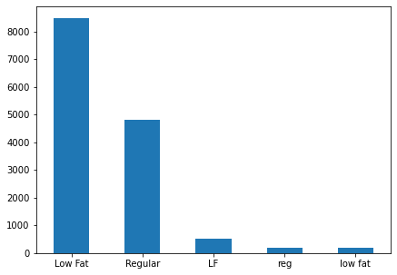
Frequency table of Item_Fat_Content
df.Item_Fat_Content.value_counts()
fig, ax = plt.subplots(figsize = (7,5))
df['Item_Fat_Content'].value_counts().plot(ax = ax, kind = 'bar', rot = 0)
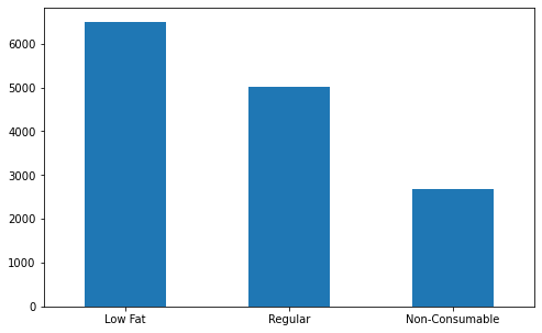
Observations
- Although the above table gives 5 types, it can actually be combined into 3 unique types:
- Low Fat
- Regular
- Non-Consumable (since there are items of health and hygiene types)
# cleaning up the Item_Fat_Contents
df['Item_Fat_Content'] = df['Item_Fat_Content'].replace(['LF','low fat'],'Low Fat')
df['Item_Fat_Content'] = df['Item_Fat_Content'].replace(['reg'],'Regular')
df.loc[df['Item_Type_cat']=='Non-Consumable','Item_Fat_Content'] = 'Non-Consumable'
df.Item_Fat_Content.value_counts()
fig, ax = plt.subplots(figsize = (8,5))
df['Item_Fat_Content'].value_counts().plot(ax = ax, kind = 'bar', rot = 0)
Frequency table of Outlet_Location_Type
df.Outlet_Location_Type.value_counts().sort_index()
fig, ax = plt.subplots(figsize = (8,5))
df['Outlet_Location_Type'].value_counts().sort_index().plot(ax = ax, kind = 'bar', rot = 0)
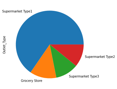
# frequency table of Outlet_Type
df.Outlet_Type.value_counts().sort_index()
fig, ax = plt.subplots(figsize = (8,5))
df['Outlet_Type'].value_counts().plot(ax = ax, kind = 'pie')
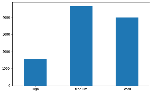
# frequency table of Outlet_Size
# expected missing values here
df.Outlet_Size.value_counts().sort_index()
fig, ax = plt.subplots(figsize = (8,5))
df['Outlet_Size'].value_counts().sort_index().plot(ax = ax, kind = 'bar', rot = 0)
# notice there are relatively more Medium Outlet size compared to other sizes
# print out the total number of missing value before imputation
sum(df['Outlet_Size'].isnull())
Imputation on Outlet_Size
imr = SimpleImputer(missing_values = np.nan, strategy = 'most_frequent')
imr = imr.fit(df[['Outlet_Size']])
df['Outlet_Size'] = imr.transform(df[['Outlet_Size']]).ravel()

# print total number of missing values after imputation
sum(df['Outlet_Size'].isnull())
df.Outlet_Size.value_counts().sort_index()
Continuous Variables
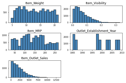
df.describe()
Observations
- Looks like there exists outliers in variable Item_Visibility and Item_Outlet_Sales
- Missing values in Item_Weight
- A value of 0 in Item_Visibility does not make sense
df.hist(bins = 20, color = 'steelblue', edgecolor = 'black', linewidth = 1.0,
       xlabelsize = 8, ylabelsize = 8, grid = False)
plt.tight_layout(rect = (0,0,1.2,1.2))
Imputation on Item_Weight
imr_wt = SimpleImputer(missing_values = np.nan, strategy = 'mean')
imr_wt = imr_wt.fit(df[['Item_Weight']])
df['Item_Weight'] = imr_wt.transform(df[['Item_Weight']]).ravel()

# print total number of missing values after imputation
sum(df['Item_Weight'].isnull())
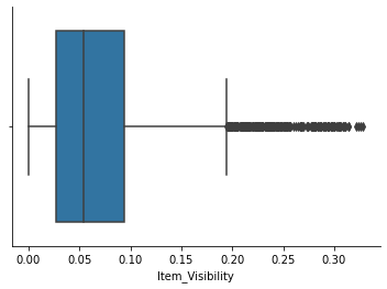
Item_Visibility
# indeed there exists quite a few outliers in variable Item_Visibility
sns.boxplot(df['Item_Visibility'])
sns.despine()
A Little Cleaning on Item_Visibility
Although the above box plot shows outliers existing in this variable, we will still keep them as sometimes larger size items do take up more display area. However, as mentioned before, a display area percentage of 0% does not make any practical sense. We will replace all 0%'s using mean-value imputation.
np.sum([df['Item_Visibility'] == 0])
imr_vs = SimpleImputer(missing_values = 0, strategy = 'mean')
imr_vs = imr_vs.fit(df[['Item_Visibility']])
df['Item_Visibility'] = imr_vs.transform(df[['Item_Visibility']]).ravel()

# print total number of missing values after imputation
np.sum([df['Item_Visibility'] == 0])
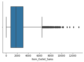
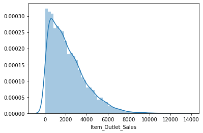
Item_Outlet_Sales
sns.boxplot(df['Item_Outlet_Sales'])
sns.despine()
sns.distplot(df['Item_Outlet_Sales'])
# we dont perform any outlier treatment on target variable on this project
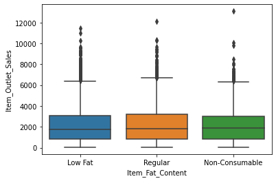
Bivariate Analysis
sns.boxplot(x = 'Item_Fat_Content', y = 'Item_Outlet_Sales', data = df)
# since we already grouped items into 3 categories
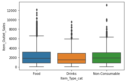
sns.boxplot(x = 'Item_Type_cat', y = 'Item_Outlet_Sales', data = df)
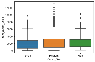
sns.boxplot(x = 'Outlet_Size', y = 'Item_Outlet_Sales', data = df,
           order =['Small','Medium','High'])
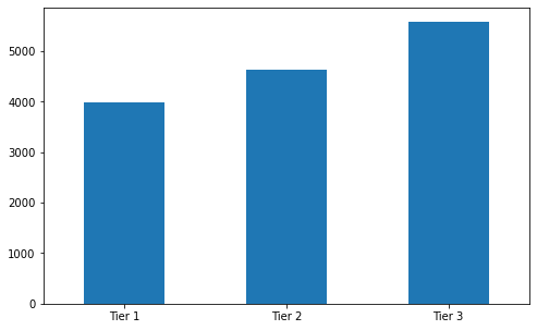
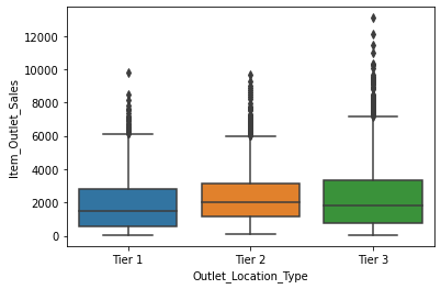
sns.boxplot(x = 'Outlet_Location_Type', y = 'Item_Outlet_Sales',data = df,
           order =['Tier 1','Tier 2','Tier 3'])
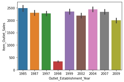
sns.barplot(x = 'Outlet_Establishment_Year', y = 'Item_Outlet_Sales', data = df)
# we should transform 'Outlet_Establishment_Year' variable so we can get more insights
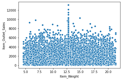
sns.scatterplot(x = 'Item_Weight', y = 'Item_Outlet_Sales', data = df)
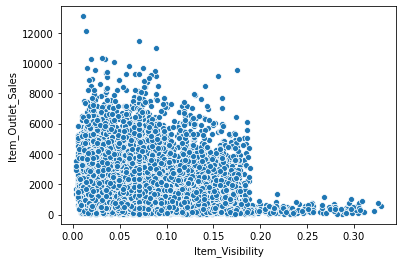
sns.scatterplot(x = 'Item_Visibility', y = 'Item_Outlet_Sales',data = df)
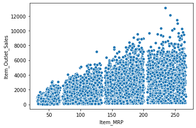
sns.scatterplot(x = 'Item_MRP', y = 'Item_Outlet_Sales', data = df)
Feature Engineering
# one-hot encoding
code_numeric = {'Low Fat': 1, 'Regular':2, 'Non-Consumable':3,
                'Food':1, 'Drinks': 2, 'Non-Consumable':3,
                'Small':1,'Medium':2,'High':3,
                'Supermarket Type1':1,'Supermarket Type2':2,'Supermarket Type3':3, 'Grocery Store':4,
                'Tier 1':1, 'Tier 2':2, 'Tier 3':3
               }
df = df.applymap(lambda i: code_numeric.get(i) if i in code_numeric else i)
df.info()
# transforming establishment year
df['Outlet_Establishment_Year'] = 2013-df['Outlet_Establishment_Year']
df['Outlet_Establishment_Year'].value_counts()
Exporting datasets
df
df.columns
IDcols = ['Item_Identifier', 'Outlet_Identifier']
ids = df_test[IDcols]
ids
pd.set_option('mode.chained_assignment',None)
df.drop(['Item_Type'], axis = 1, inplace = True)
df.drop(IDcols, axis = 1, inplace = True)

df_train = df.loc[df['source'] == 'train']
df_test = df.loc[df['source'] == 'test']
df_train.drop(['source'], axis = 1, inplace = True)
df_test.drop(['source'], axis = 1, inplace = True)
df_train.head()
Variable Correlations
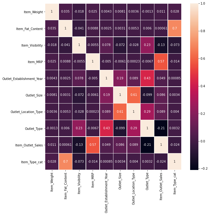
fig, ax = plt.subplots(figsize = (10,10))
sns.heatmap(df_train.corr(), annot = True, linewidths = .5, ax = ax)
Predictive Modeling
Linear Regression
# defining relevant variables
y_train = df_train['Item_Outlet_Sales']
y_test = df_test['Item_Outlet_Sales']

X_train = df_train.drop(['Item_Outlet_Sales'], axis = 1)
X_test = df_test.drop(['Item_Outlet_Sales'], axis = 1)
from sklearn.linear_model import LinearRegression
model = LinearRegression(normalize = True)
model.fit(X_train, y_train)
model.intercept_, model.coef_
y_predict = model.predict(X_test)
y_predict
Sales Prediction
ids['Item_Outlet_Sales'] = y_predict
prediction = pd.DataFrame(ids)
prediction.to_csv('submission.csv', index = False)
prediction
Conclusion
Taking a look at the result "submission.csv", 110 observations of negative sales are observed while the rest 5571 observations are positive sales. This is expected since we are using a linear model here, we could use a natural log on the Item_MRP during our analysis to help. However, we know the relationship here is not linear. This project is only for practicing purpose.